AJ Scarcella
Editor. Animator. Designer. Maker.
AJ Scarcella
Editor. Animator. Designer. Maker.
AJ & Isaac is my two-person, long-form improv group. Though still in its infancy, I designed this logo suite for usage in a wide variety of scenarios: merchandising, marketing, web, and so on. The logo features simple, pictorial representations of the two cast members, designed in a way that makes them not only easily identifiable, but easily re-produced in different forms (physical badges, stickers, etc).
The Rat King is a conglomeration of some of Sydney’s best improvisers, comedians and actors, born from what some would call an unnatural amount of time spent in each other’s company. As one of the founding members, I took on the task of designing a visual identity that was very far removed from the more disgusting origins of the name.
You can visit the website here.
Movie Film Studios is a weekly podcast I co-created, star in and produce. In it, two fictitious Hollywood movie producers watch trailers and then attempt to capitalise on customer demand by pitching an original film inspired by the trailers. This is the logo suite for the podcast which was designed to not only illustrate the concept of the podcast, but the concept of the movie studio itself.
Movie Film Studios can be listened to through any podcast app or through the website.
The oft-forgotten* action man of the 80s, Rex O’Naugh’s film career spanned years and featured dozens of high-octane thrills and spills. I directed, edited and produced this supercut, which was a component of the The Rise and Fall and Rise of Rex O’Naugh, a semi-improvised stage play that was mounted during Sydney Fringe Comedy 2018. I also directed and acted in the show, as well as put together its visual design.
*completely made-up
Invert-x is (currently) a short-form, opinion column style blog between two writers. Topics are decided upon each week, and the writers create a 500 word opinion on the subject. We don’t adopt a specific viewpoint, nor do we write in any specific style: we just write. We also make sure that writers don’t see what the other has posted until it’s gone live, to make sure opinions aren’t filtered by their opposite’s piece.
Invert-x was designed and constructed by myself, utilising WordPress as a backend.
Check out Invert-x.
While employed at ASFA, I was responsible for the creative direction of the organisation’s annual national conference. As part of this role, I designed all aspects of the branding for the conference, including the stage layout, video content, printed collateral, website and onsite signage.
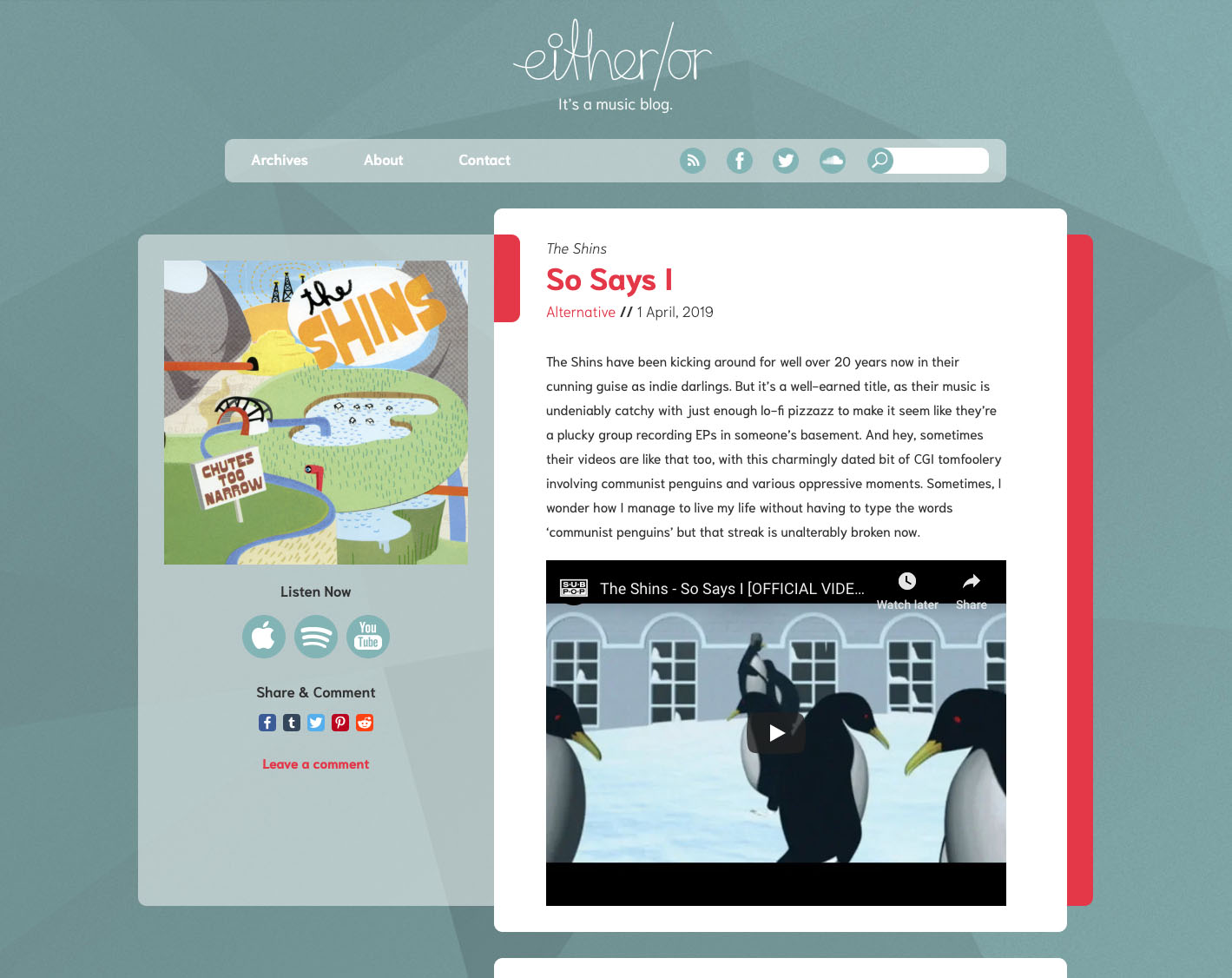
either/or is a music blog that I co-created and currently run. The logo is a straight bit of Illustrator work based on a handwriting sample that I made.
The website itself runs on the WordPress content management system. either/or’s theme was created from scratch by me.
Make sure you check out either/or.
A current work in progress, this is an exercise in minimalism in digital, informative design: just how much information does a train schedule app really need? Is there a true advantage to presenting schedule information digitally, as opposed to a printed timetable?
Rather than simply show a list of trains and times, this app seeks to inform you how much time you’ve got until your very next train arrives. Information is clear and immediate, and presented in a clean, fun fashion.